Tuque de Broue
bringing things to a head
| Services | Brand Identity | Art Direction | Packaging Design | Copywriting | Environmental Graphics |
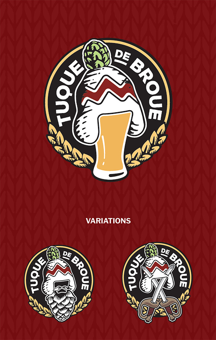
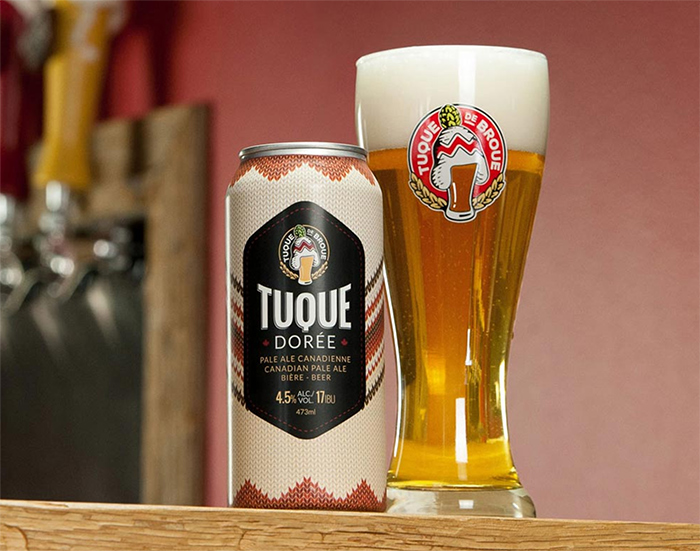
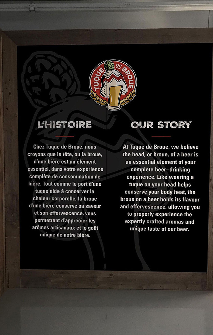
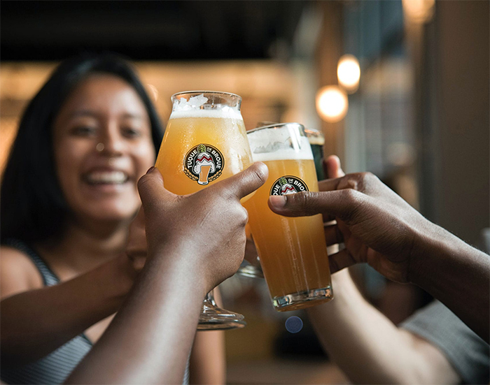
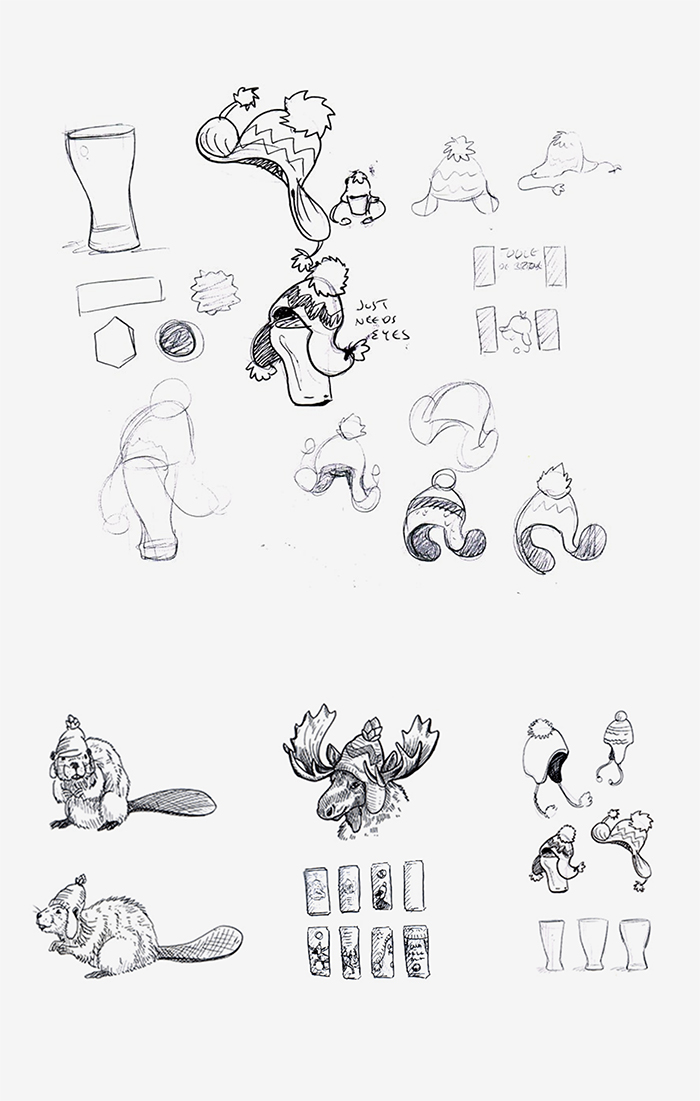
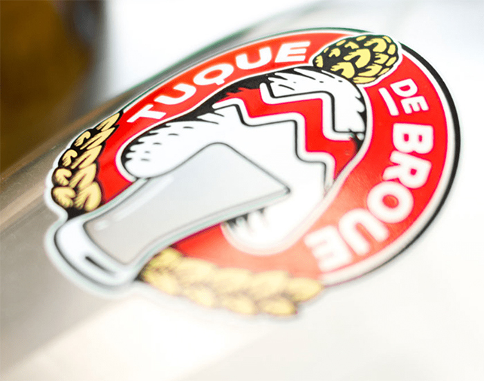
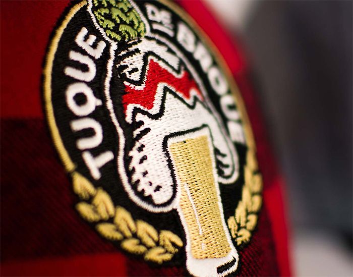
Keeping the head on a beer is essential for maintaining the flavour and effervescence. This was the inspiration behind the name of this craft brewery, and greenmelon was entrusted to build the brand from this elemental idea. Cheers!
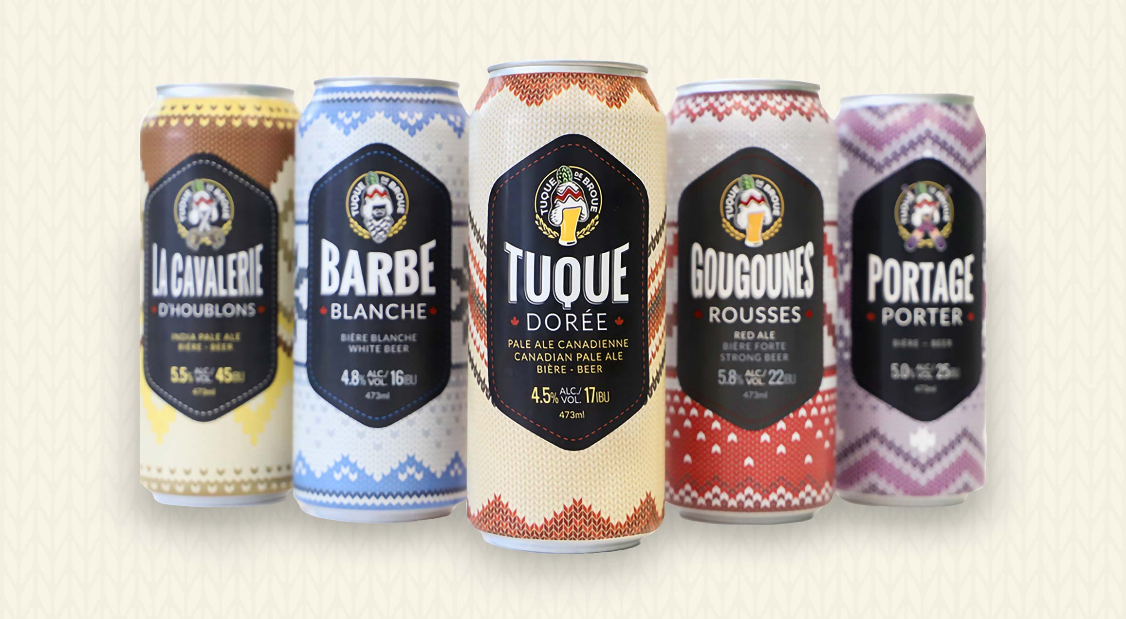
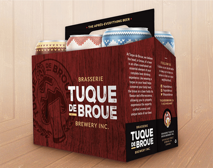
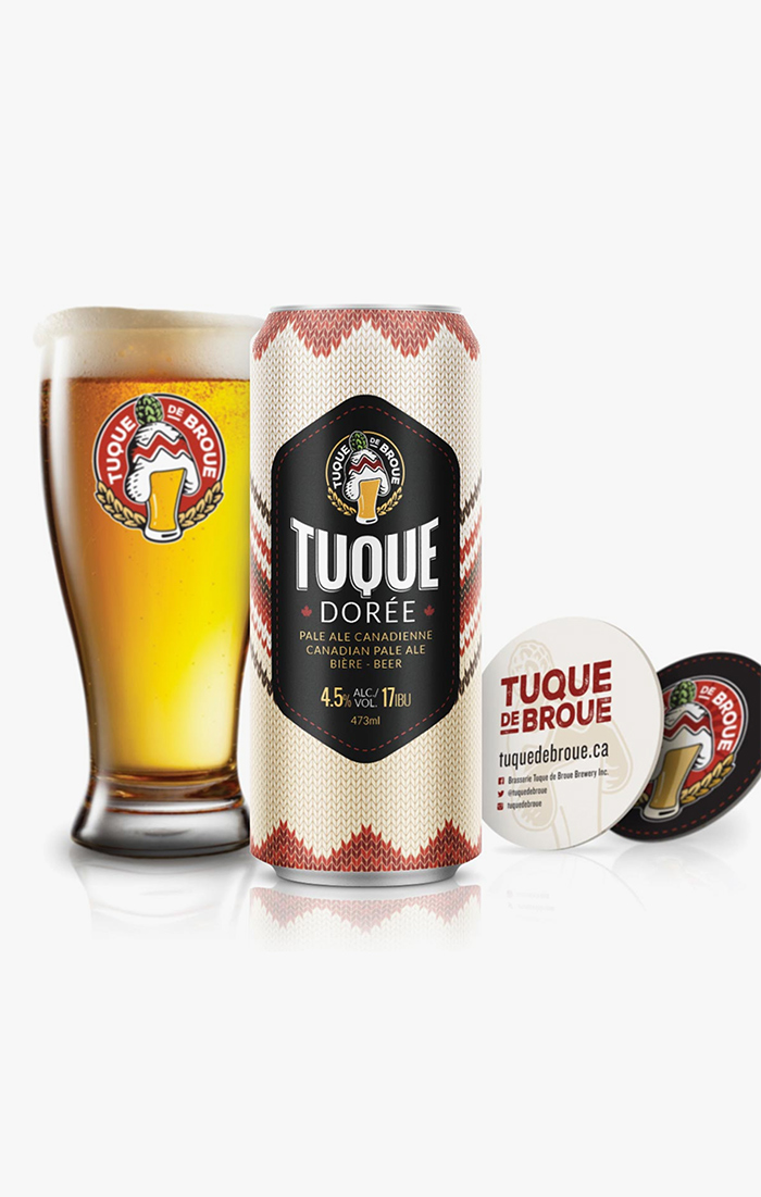
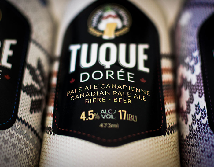
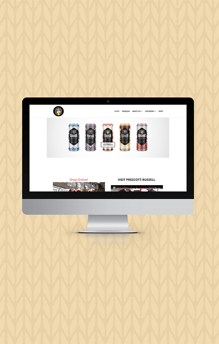
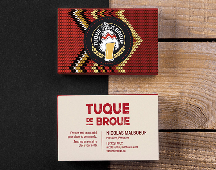
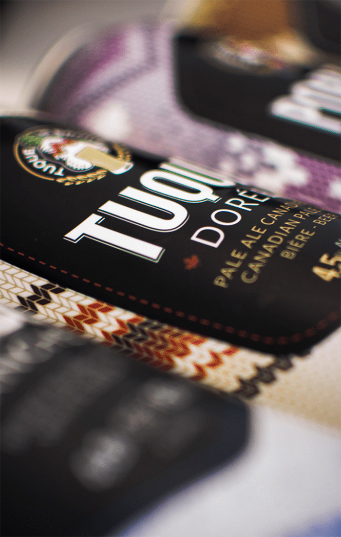
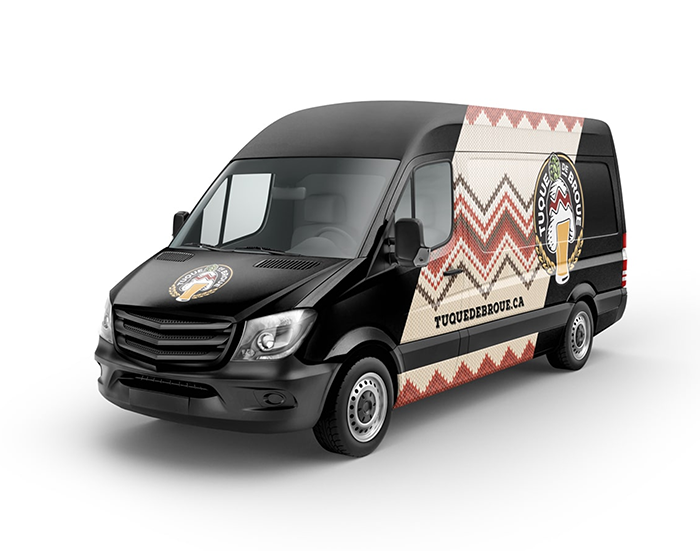
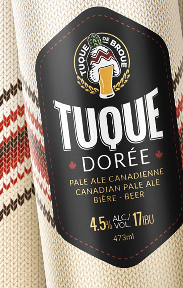
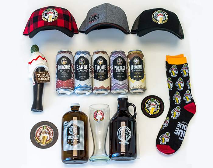
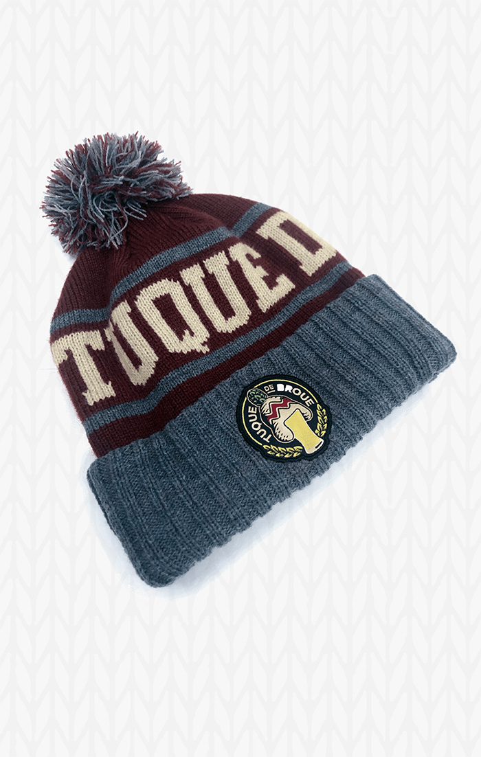
Since the client was based in the Ottawa valley, the traditional Canadian toque was the basis for this brand and subsequent packaging. Using a knitted pattern as the unique can design, we added a “crest” to give the logo and information a proper backdrop for contrast and appeal. This look and feel was further used in line extensions giving each beer a unique pattern and colour while maintaining brand consistency.
