Bro Dough
helping a bro make some dough
| Services | Brand Identity | Packaging Design | Copywriting | Website Design |
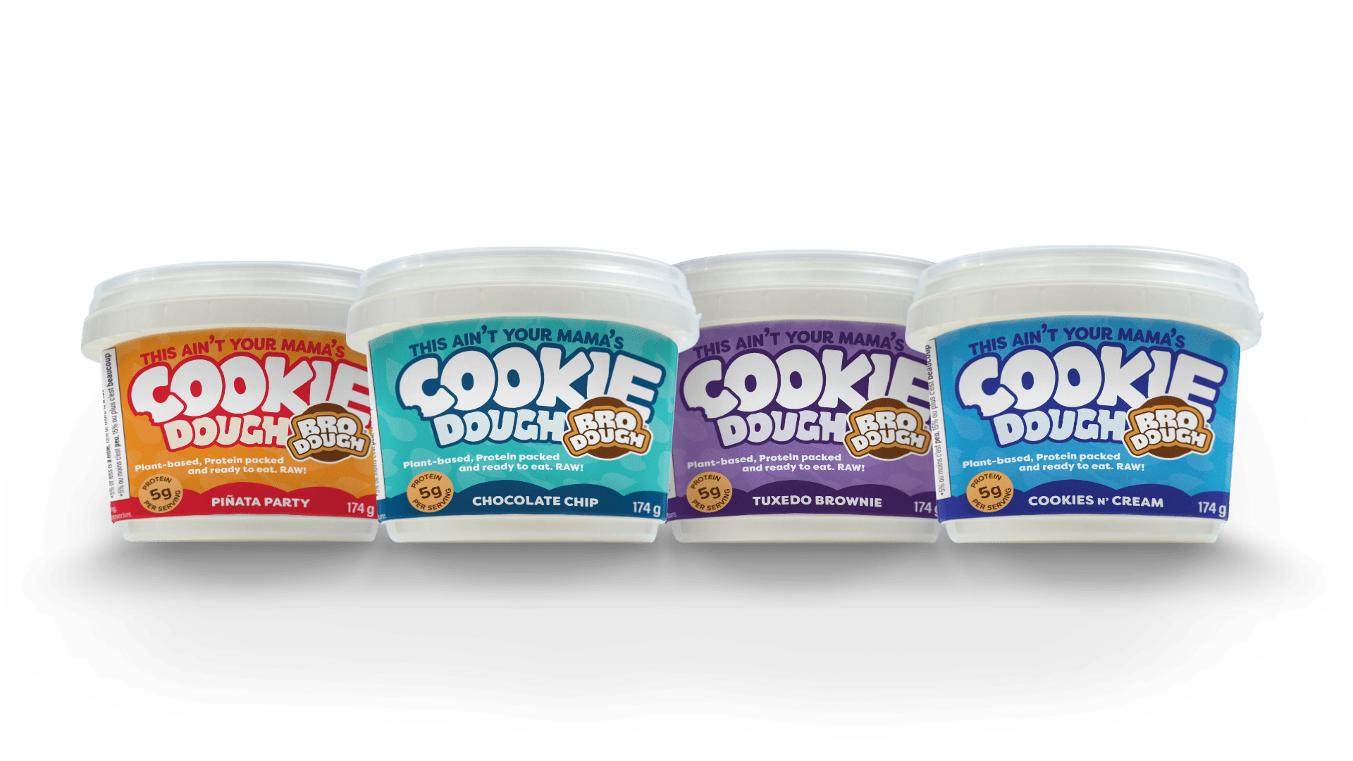
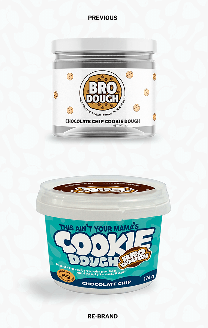
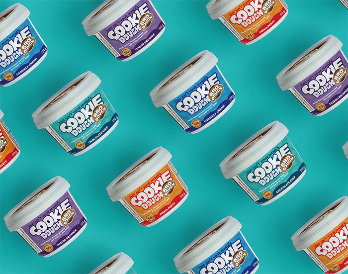
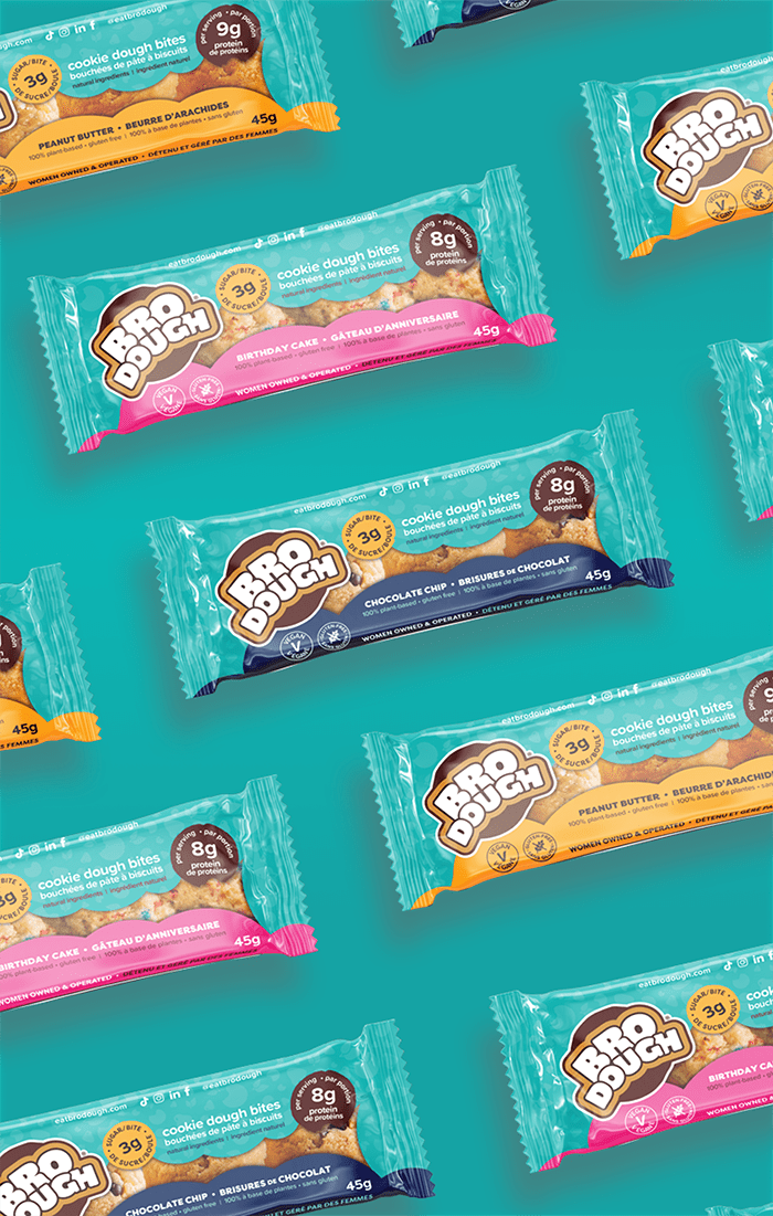
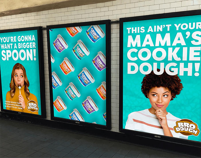
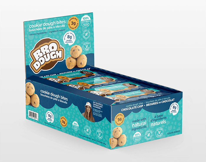
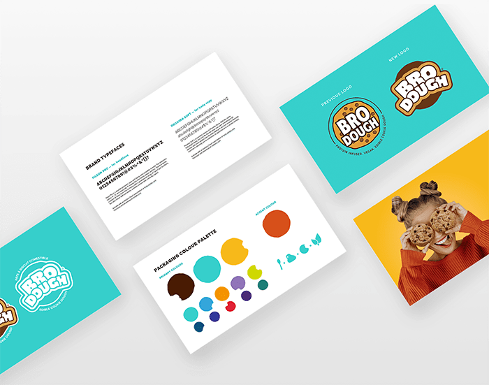
With the understanding that consumers shop with their eyes first, then their stomach, and finally their brain, we helped this plucky start-up find it’s brand bravado. We knew that appealing to your inner child by leading with ‘cookie dough’ and using bold colours would help get this new brand in carts and bellies.
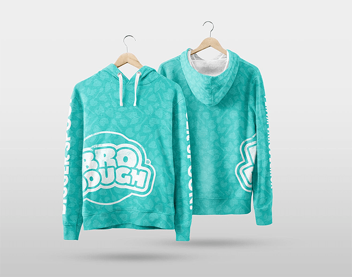
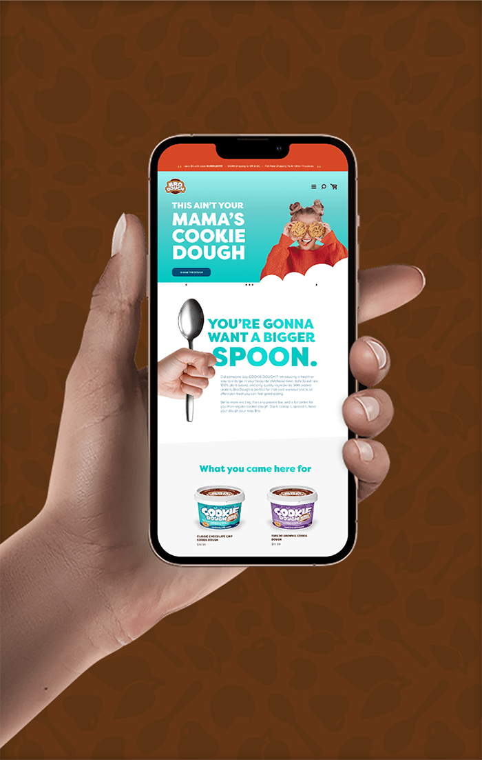
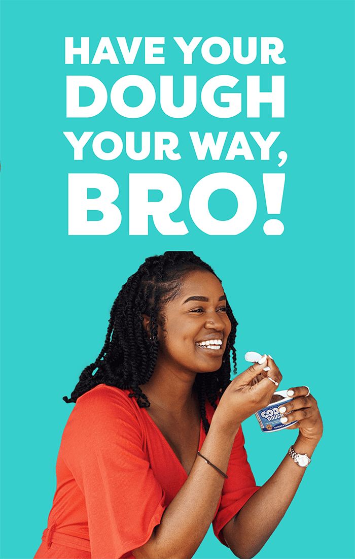
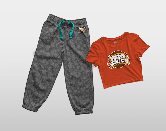
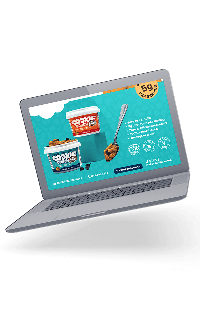
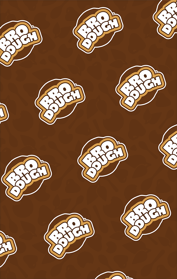
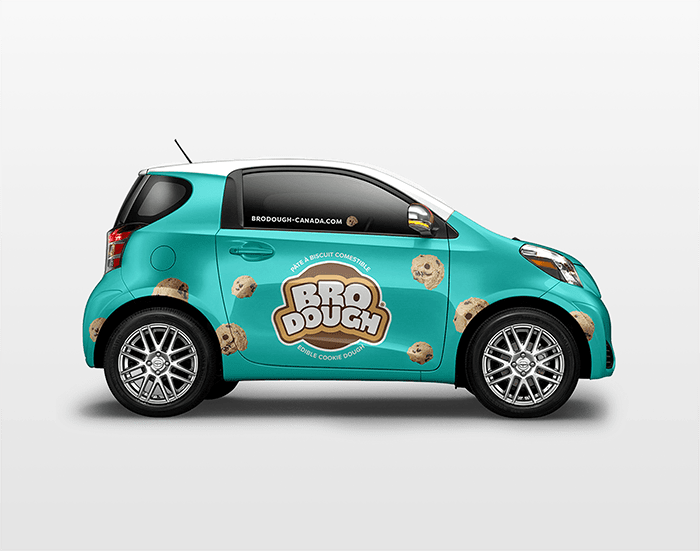
Sharing might be caring, but not when it comes to your cookie dough (you might want to keep all of it for yourself, am I right?). Keeping that playfulness in mind, designing a brand full of attitude was what Bro Dough needed. And we made sure to bring the attitude in every aspect of the branding and website; bold, bright colours, playful typefaces, and messaging that brings the ‘bro’ in a fun and playful Wonka-esque cookie dough store—because you can never get enough of some crazy good cookie dough.
