ABI
branding beyond the boardroom
| Services | Brand Identity | Website Design | Social Media Engagement | Environmental Graphics |
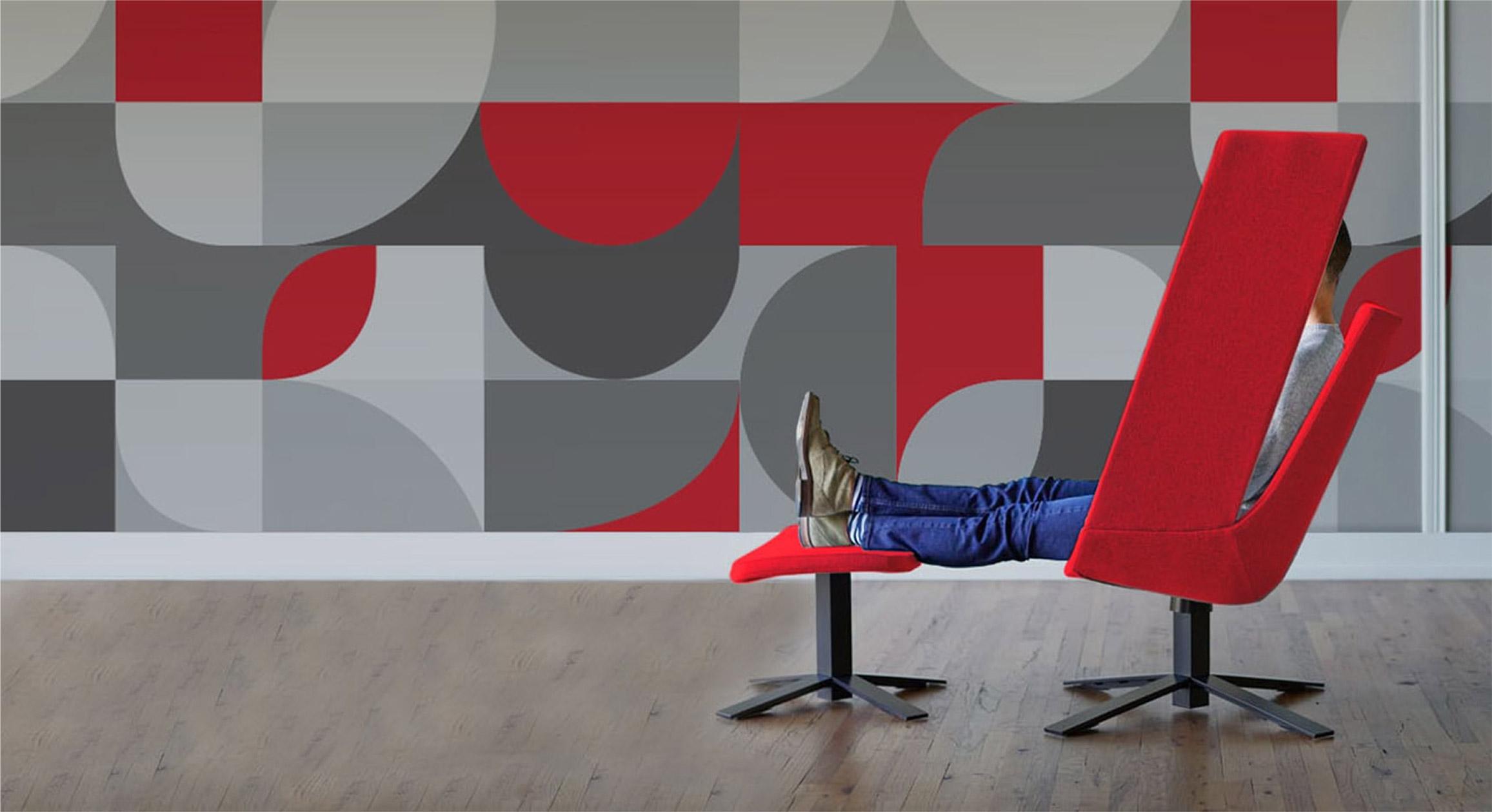
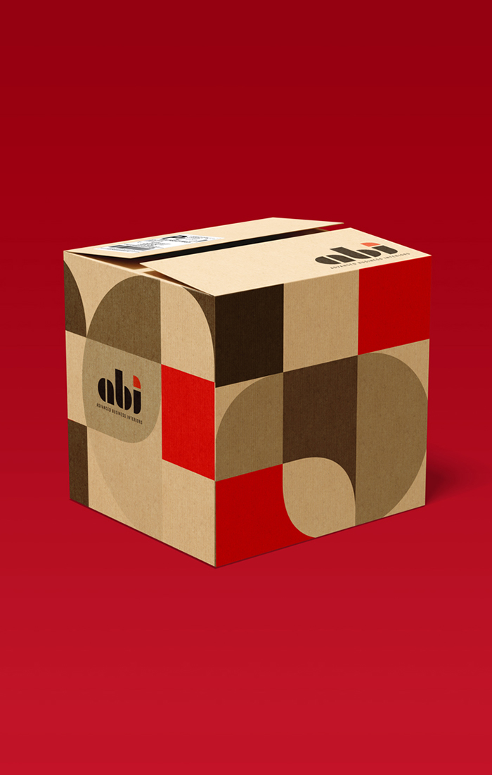
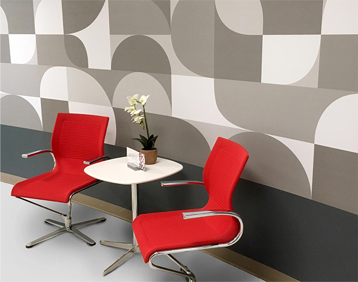
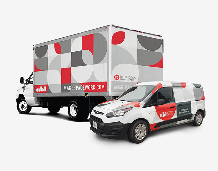
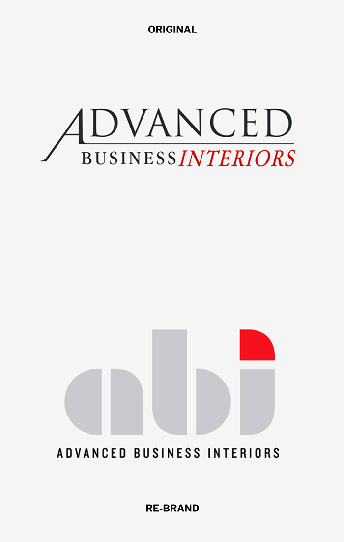
With their 25th anniversary approaching, we were asked to revitalize the ABI brand for the next twenty-five. Although there as much competition in the local industry, we discovered that there was no obvious leader in the sector. This was the prefect opportunity to refresh their brand and claim the number one position.
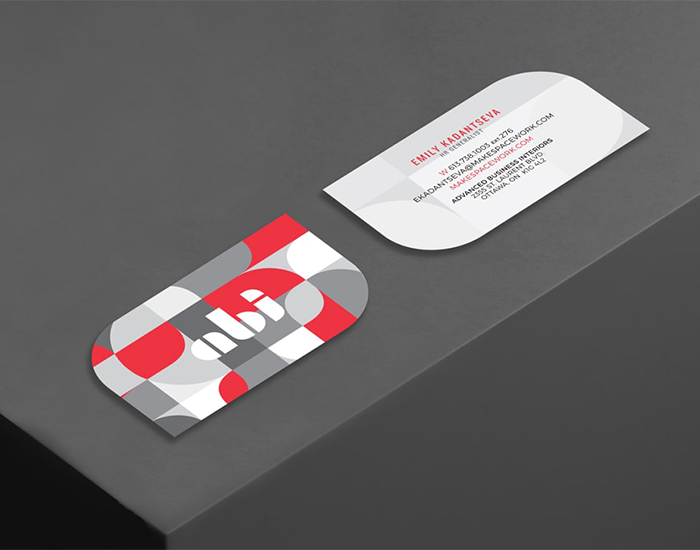
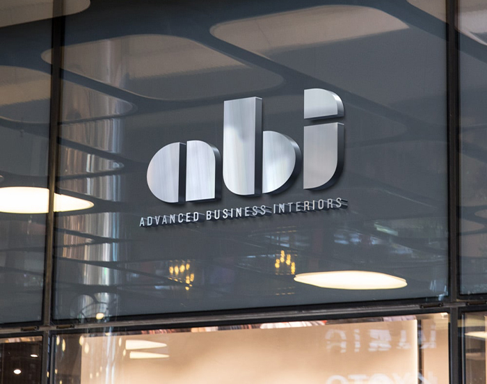
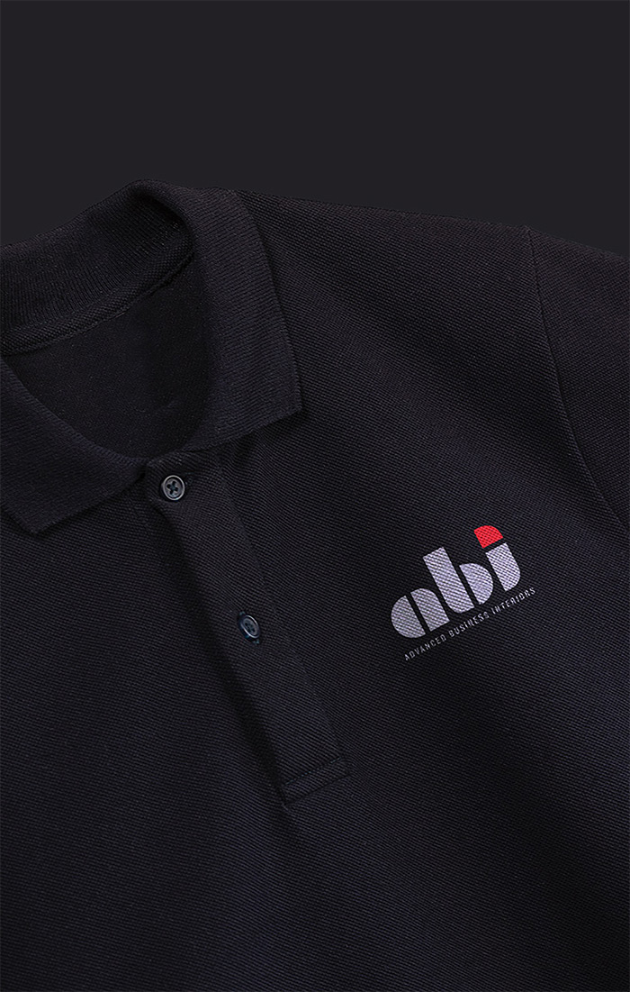
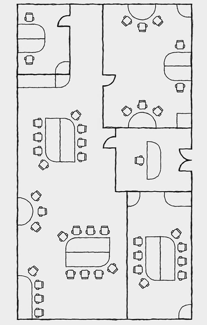
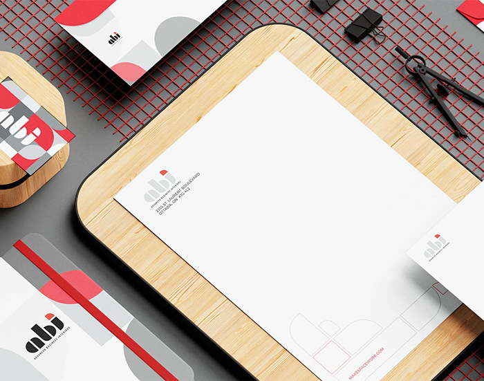
Since the company was known colloquially by their initials, we approached the logo with this in mind, referencing their sector by using interior design symbols. The result was a bold, strong, and confident visual, with an additional level of meaning for office designers who can see that ABI quite literally ‘speaks their language.’
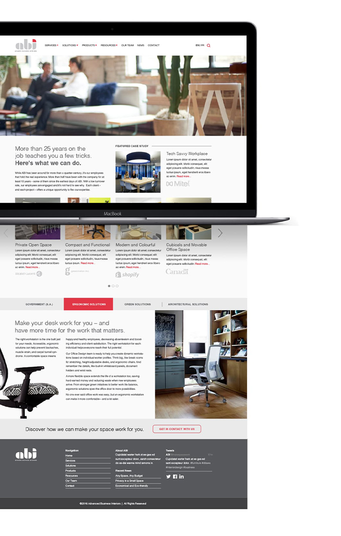
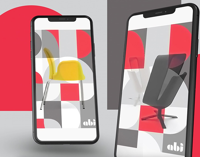
The roll-out of the new brand included a complete redesign and implementation of their website. We transitioned the site from a catalogue presence to a resource for clients with credible content focused on office planning and design. The result was a leap from page two to ranking second on Google searches.
